Virtuoso mobile redesign
Problem
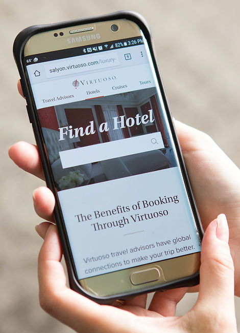
The old Virtuoso.com mobile site was geared toward travel advisors and didn't work at all for its most common users: travelers themselves. The business was missing opportunities to connect travelers with travel advisors on mobile. Additionally, we had no design system or pattern library on desktop or mobile.
Process
I led research, information architecture, and workflow design efforts for this project. I also worked with 2 designers and 2 UI developers to establish a pattern library and design and build a new mobile site from scratch.
Impact
Launch of the new UI and mobile site increased overall conversions, mobile conversions, and network revenue.

Mobile architecture and workflow
Virtuoso.com had 2 main users: member travel advisors and consumer travelers. The old mobile site was geared toward travel advisors; the problem is about 75% of the Virtuoso.com mobile users at the time were travelers. This data led us to create a mobile site structure with a simple, consumer-facing architecture and workflow: let users search for and browse travel advisors and the most popular products and help guide users to the advisor that's right for them quickly and efficiently.


Wireframing and prototyping
I worked with 2 other designers to determine the basic page structures and workflow for the site. Each of the three of use took different sections of the site and created medium-fidelity wireframes. I focused on the Tours section and our "Recommended Advisors" experience. Using these wireframes, I facilitated usability testing to evaluate major interactions and the high level workflow. After some tweaks from the testing, we let our UI developers start coding the basic site and page structure while we figured out the visual design.
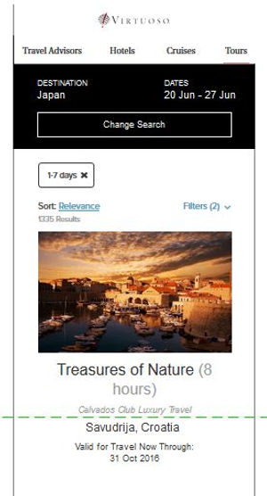


Creating a pattern library
Myself and the 2 other designers inventoried all the UI elements that were already in use on the website. Then we individually created style tiles, or UI mood boards, as jumping-off points to coalesce on a visual style and color palette. Once we aligned on a visual style, we used this and the audit to create a pattern library. We each took about a third of the elements and components from our inventory and redesigned them to match our new visual style. I focused on form elements, filters, progress bars, maps, navigation, and the datepicker. Creating a pattern library at this time allowed us to be consistent in our mobile design, from card styles down to margin between elements.


Outcomes and impact
After months of close collaboration with our UI developers, the final product came out great. We usability tested again just before release on almost finished product to get more authentic and externally valid user feedback. We also launched the new UI from our pattern library on desktop in addition to launching the new mobile site.


Bonus: Destination page redesign
I redesigned Virtuoso's destination pages based on the new visual style we launched with the mobile site, but I left before I could advocate for and drive implementation of these new designs. I crafted them such that modules would automatically pull in editorial articles, travel products (hotels, cruises, and tours), and travel advisors based on existing metadata already associated with those objects. This would have enabled easy scaling for pages with lots of associated content (like the one in the example), all the way down to pages with only a single associated object.
Before

After
